When I first saw this machine in the doctor’s office (waiting, bored) I thought the duplication of the labels – especially on the power button – was silly. Then I realized that I was being Anglo-centric and that having both enables use by more people, in more places.
In/Coherent Design
Every now and then I come across things – or the designs of things – that I particularly like or dislike. This is where I (intend to) record such things.
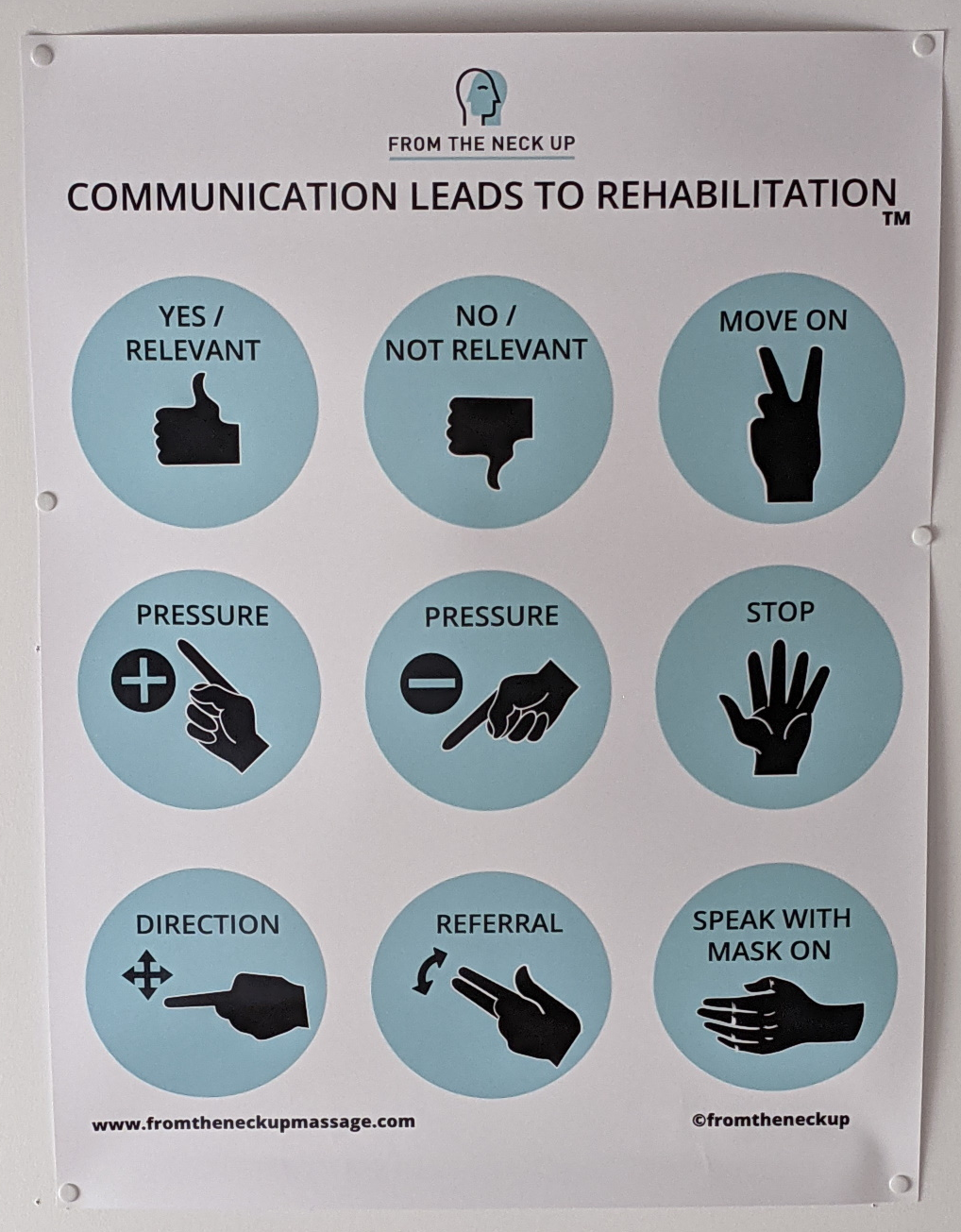
Instructions on the ceiling
From the Neck Up does neck-up massage, including intra-oral. When the RMT has their fingers in your mouth it’s pretty hard to give directions. So there are hand signs for communicating with the RMT. And, since you’re laying on your back during the procedure, the guide to the signs are posted on the ceiling.
First Post: someone's last post
I often come across digital and physical interface designs that are either great (coherent) or terrible (incoherent). For some mysterious reason I’ve been wanting to capture such interfaces and share them.
To start, a curious headstone.
The goal of the design of a headstone is to be read by the living. For a few decades some of the people who read it will have known the deceased, but many won’t, and after a while no one will have personally known them. The design of this headstone ensures that it will get more reading-attention than an ordinary headstone. I certainly stood in front of it longer than any other, while figuring out how to decipher and read it.