Page actions – the buttons in a browser’s address bar – are a surprising UI failure.
When adding a button for a browser extension, a choice must be made whether to make it a “page action” or a “browser action” (button on the toolbar). But browsers have failed to communicate the interactiveness of page actions, and almost no one – techy or layman – realizes that they’re clickable.
To complement the context menu item and hotkey, and to fulfil a user feature request, I decided to add a button to the Markdown Here browser extension. It turned out that simply deciding where to put the button was a big part of the effort…
## Page Action vs. Browser Action
I’m going to use the Chrome extension development terminology:
- Page actions...
- are the buttons and status indicators located in the address/omni/awesome bar. (See
pageActionAPI info.) - Browser actions...
- are buttons on the browser toolbar. (See
browserActionAPI info.)
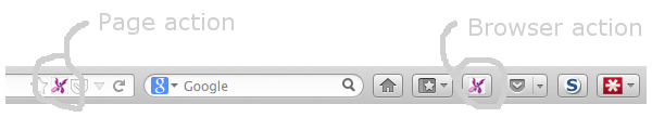
In the screenshot above you can see the two styles co-existing in Firefox, which suggests there’s no real implementation decision to make – just provide both, and let the user decide which style they like. That’s true in Firefox (although there’s still the lesser decision of whether or not to add the toolbar button by default), but in Chrome you can either have a page action or a browser action, not both.
The choice initially seemed pretty obvious: use a page action. From Chrome’s documentation for browser actions:
Don’t use browser actions for features that make sense for only a few pages. Use page actions instead.
Markdown Here’s button is only applicable to some rich-edit compose elements (email, mostly), so that admonition seems to apply pretty directly. Like many people, I don’t like occasional-use buttons cluttering up my toolbar, so I initially implemented the button as a page action.
## Apparently Imperceptible Affordance
…And then I showed the cool new button to my significant other, who said something along the lines of “I can click that?” Which is a pretty damning statement, for a button.
I must admit that I had some suspicions about the obviousness of page actions’ clickability. I’m fairly sure it took me a while to realize I could click them, and I’m a) pretty technically savvy, and b) pretty hover-over-everything-that-looks-interesting curious. But what if a user is not both of those things…?
So I asked around. I asked in the Markdown Here Google Group, the UX StackExchange, and on Google+. These are the sorts of responses I got:
- “This [is] purely anecdotal, but I work in the web industry, and use [C]hrome everyday, and didn’t realise the page actions were clickable. I agree with you that they look more like signifiers than they do clickable buttons.”
- “But I agree that they don’t function well as buttons, perhaps this is by the design of the icon (not “raising” the element to give it depth).”
- “pageAction in the abstract is a great idea, but I always find its use a little jarring. And I agree it’s not button-like at all, more just informational.”
(Yes, there were some people who knew that page actions are clickable. But the fact that many computer/tech/web/UX-savvy people didn’t know is the more significant observation.)
I also asked around among people at the office (coders) and among non-programmer friends, and the vast majority of both groups didn’t know they could interact with page actions. At best they thought of them as status indicators, and at worst they couldn’t remember ever having noticed them before. Ugh.
### Missing Cues
It’s hard to blame users for this lack of affordance recognition. At least, not yet.
Page actions do not display any of the typical this-is-a-clickable-thing traits. For the most part, page actions:
- are not raised or underlined, like a standard button or a link, so most people won’t hover over them, but even if the user does hover, page actions…
- do not change at all when hovered over – no outline, no colour change, no raise-up, no clicky-hand mouse cursor.
Some page actions have a verb-based tooltip if you hover long enough. Some. If. Long enough.
It’s a little shocking how poorly the interactiveness is communicated to the user.
### Maybe our future selves will get it?
Above I coyly dropped “At least, not yet.” There is a trend in UI design toward everything on-screen being interactive unless explicitly disabled-looking. Windows 8 has gone this way, as has Chrome and, to a slightly lesser extent, Firefox. There’s very, very little text or window chrome that’s non-interactive.
But even if you accept the “everything is interactive” ideal, page actions are still different than most other elements, since there’s no hover effect. And page actions are further hampered by the minimalistic design aesthetic that Chrome and Firefox seem to have adopted for them – a monochrome outline icon that can easily be read as disabled.
Maybe once users have fully embraced/internalized the idea that there are no extraneous UI elements, they won’t need hover effects and raised borders. Maybe there’ll be a great awakening to the utility of page actions. But until then…
## How to rescue page actions
Page actions need to look less like small, monochrome, passive, static icons. They need some standard button cues, both initially and on hover; they should employ one or more of: raisèd-ness, colour, border, more visual strength.
(I suspect that even the Chrome-style toolbar buttons – like the three-line settings button – are also below most laypeople’s threshold to recognize the click affordance. I’ve seen that in action in my own family-tech-support experience. Those buttons also lack most historical click cues. But let’s tilt at one windmill at a time…)
### Tangent: Chrome needs to allow both page and browser actions
Finally, Chrome should allow extensions to provide both page actions and browser actions.
In the screenshot at the top of this post, you see can that Pocket’s Firefox extension uses both button styles: the page action is for saving the current page, while the browser action is for showing your saved pages. Similarly for the bookmarks buttons: page action for bookmarking the page, browser action for viewing bookmarks.
(Markdown Here also has a button in each place, but it’s not as compelling a use case, since it’s just a convenience to work around the page action affordance opacity. Both buttons toggle Markdown rendering; the page action only shows when focus is in a valid target; you can hide the toolbar button if you’re one of the few page-action-savvy users. But, still, I wish I could provide the same flexibility to my Chrome users that I do to my Firefox users.)
In Chrome, Pocket only has a browser action (which, oddly enough, acts only like its Firefox page action), and bookmarks only have a page action (and a whole toolbar). I can’t think of any reason for Chrome to prevent extensions from providing both, and there are certainly good use cases for allowing them.
## So it’s back to a browser action
I finally switched the Markdown Here toggle button in Chrome to be a browser action. Even though it clearly, spiritually, should be a page action, I just can’t ignore the fact that most users will not recognize it as clickable in that form.
I have had one complaint about the button location, but the user seemed satisfied that I made the rational choice after I explained it.
## Update 2017-10-28
Last year Chrome turned page actions into browser actions. The description of the change suggests that this was a security decision. Evil stealth extensions were being installed, so now all extensions have to have toolbar buttons to expose them to users. (FWIW, I don’t think this is a good solution to the problem. I’m sure the majority of users don’t pay much attention to random toolbar buttons.) It makes little sense for page action-centric extensions to have both a sometimes-visible address bar button and an always-visible toolbar button, so the Chrome team did away with the address bar button.
Firefox hasn’t made a similar change. You’d think that if there’s solid security rationale for one browser, that it’d apply to all browsers.
This makes the documentation for pageAction pretty confusing. Check out Chrome’s versus Mozilla’s documentation. Chrome’s documentation is kind of incoherent now. There seems to be no reason at all to use page actions, but the doc still suggests that you do.
I felt that page actions were kind of unusable before, but… this is worse?
The reason I was looking at this again is because I created another extension, called Breached, where a page action would, in theory, make the most sense. The button is enabled/shown when the user visits a site that has suffered a breach in the past, exposing user accounts. This is a pretty rare thing (for many people… who don’t use Yahoo Mail), so dedicating a perma-visible toolbar button to it is pretty wasteful. Still, I initially went with a browser action for the reasons given in this post. I even added a notification (shown once per site), so the user could hide the toolbar button and still notice when they visit a breached site.
Then a reviewer requested that it be a page action. I thought about it again and realized that the notification also helps with the “no one knows to click on a page action” problem by telling the user they can click on it. And the always-visible button still bugged me (and, let’s face it, most users won’t know how to hide buttons). So I changed it to a page action. And… discovered that there’s no visible difference in Chrome. Except page actions don’t support badge text, which I was using to show the number of breaches.
Anyway, I’m leaving Breached as a page action, for the sake of Firefox users.
Postscript: First blog post ever! Yay! Thanks to Casey Watts for suggesting that I write it.